
As a girl who wears glasses, I often go with bright lip shades in the evening, rather than focusing on the eyes. But for this look, inspired by Alice Lane’s conviction that what looks good in nature will look good in makeup, I thought I’d try something different.
Just so we can refresh ourselves, here’s the inspiration pic–just a quick snap I took of the early-evening sky as I chugged home from the subway.
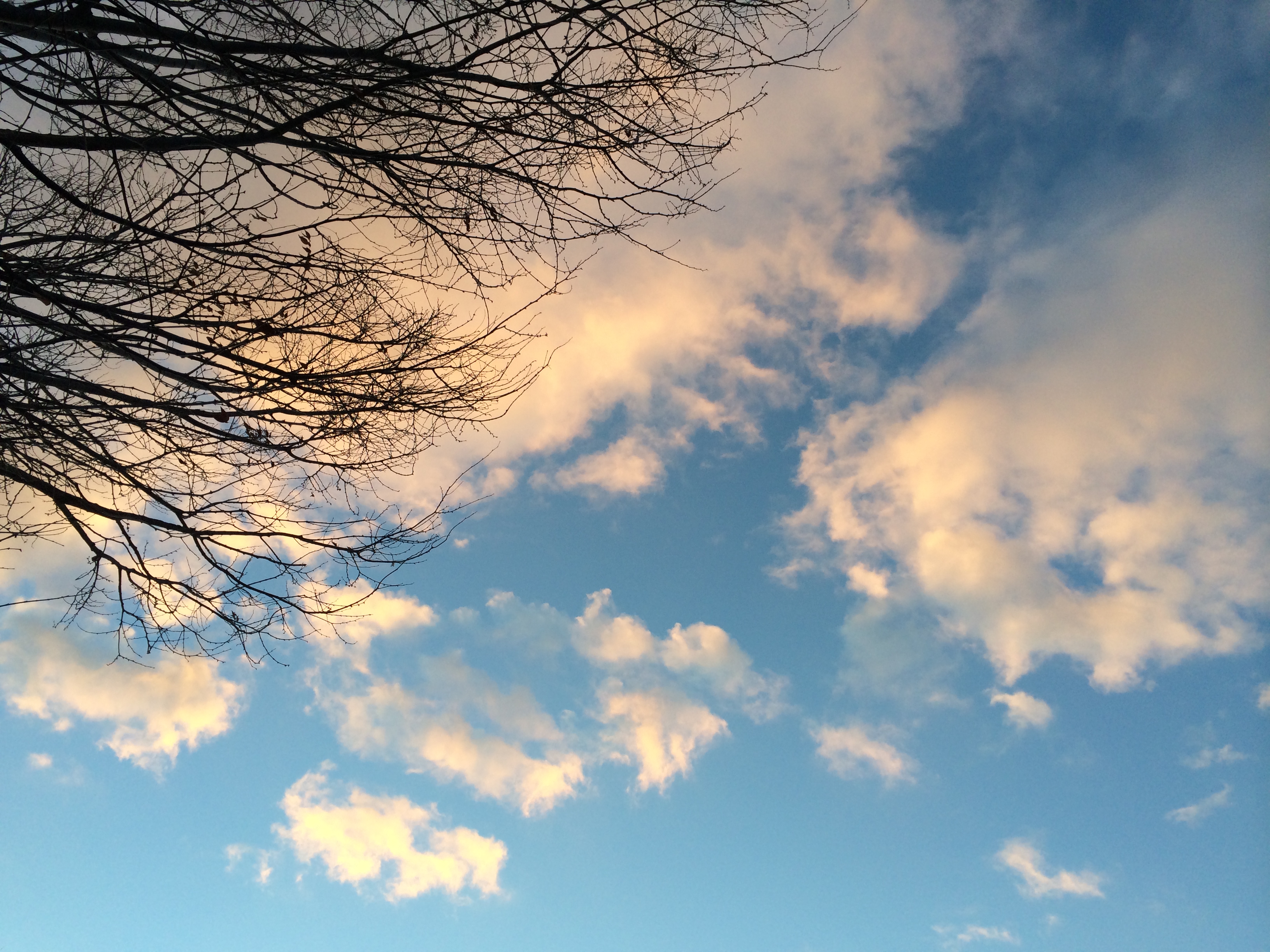
Contrasts in nature: soft gold, sky blue, black.
I was attracted to this image because of the contrasts between the clouds, sky, and branches. For the day look inspired by this image, I went with a wash of gold blending into a wash of shimmery blue on the eye, with a thin line of gel liner. For the evening look, I thought we’d try something a little different–more of a turquoise blue shadow paired with the same creamy gold, placed against a smoky, charcoal-black cream-shadow background. For lips and cheeks, I chose soft, peachy-nude shades.
Here’s the product set I brought together for the look:
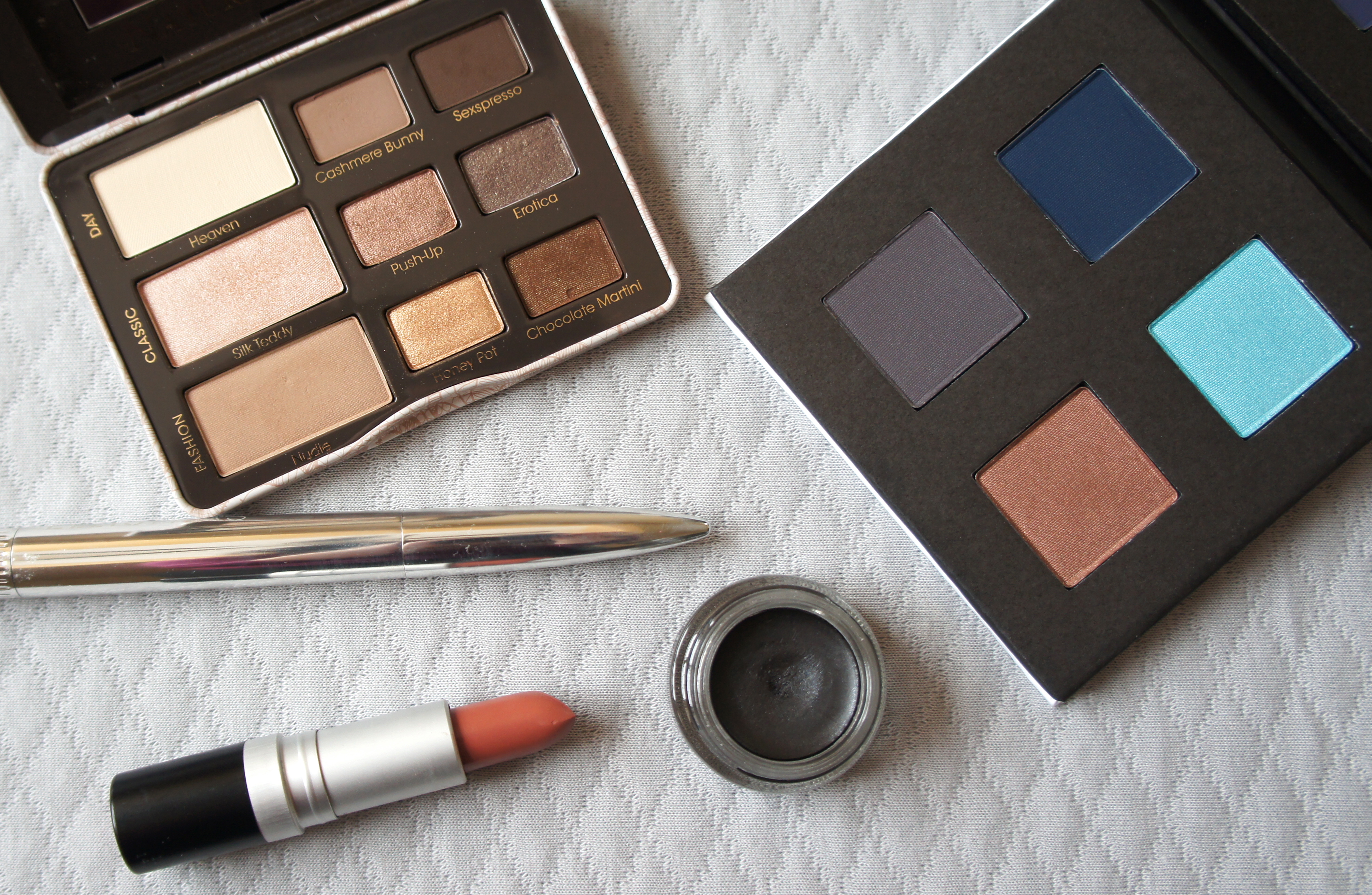
Clockwise from top left: Too Faced Natural Eyes Palette (shade Honeypot); Make Calypso eyeshadow palette (shade Aquamarine); MAC Paint Pot in Blackground; Revlon matte lipstick in Mauve it Over; Ellis Faas blush in S301.
And here’s how it came out on my face:

And a shot so you can see the lids a little bit:
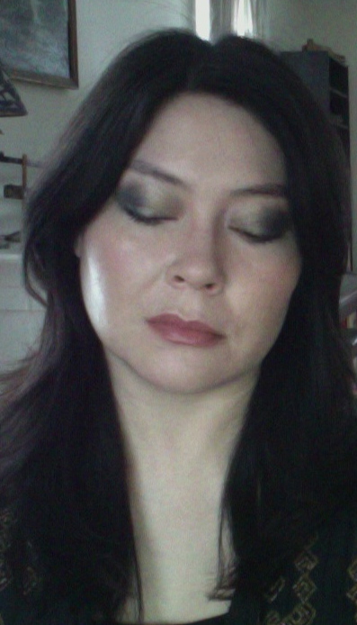
If you compare the smoky evening version of this look with the day version, you can see that the deep, charcoal-black background really transforms the paler shades. In this case, after I created the underlying shape with the dark cream shadow, I placed the gold and turquoise powder shadows on the lids in the same way as I did for the day look. On its own, the dark cream looked pretty heavy. The paler powders lifted the look and added some brightening color and shimmer, while the charcoal-black cream contributed depth.
The lighting conditions for these photos weren’t ideal, so you may wonder whether you’re actually seeing the turquoise shade here. I did place the turquoise shadow in the outer half of my eye, but I have to say that, even in real life, it didn’t show up with much oomph. I was sort of expecting to see it more, myself. I think I underestimated the amount of white pigment in the shadow…hmmmm, I’m not quite sure what happened, but anyway, in real life, the turquoise didn’t jump out and make a big impression. It’s not just the photo!
A few notes on products and application, for what they’re worth!
Base. Basically none–unfortunately, my skin is too sensitive to tolerate any base products at the moment, so I have to just try to roll with the pink-ness. I did put some Clinique Airbrush concealer under my eyes–otherwise, you wouldn’t have been able to distinguish the shadow from the dark circles!
Eyes. MAC Blackground cream shadow as a base; Too Faced Honeypot shadow patted over the cream in the inner half of the eyes; Make Aquamarine shadow patted over the outer corners. No liner.
Cheeks. A bit of Ellis Faas blusher in S301 patted into the apples of the cheeks–kind of pointless given the sensitivity and pink-ness, but it’s there!
Lips. Base of Nuxe lip balm; Revlon lipstick in Mauve it Over applied over the top, straight from the bullet.
Final thoughts. It was great to make a change from strong lips to stronger eyes, and fun to play with the powder-shadow-over-deep-cream-base technique. My friends seemed mildly surprised that the gold/blue combination seemed to hang together comfortably. Yellow and blue together make a nice contrast, so it shouldn’t have been much of a stretch to start pairing gold and blue shadows, but I had never thought to do it before. Nice thing to try, and I’m going to keep my eyes peeled for more color schemes that are inspired by nature–and, of course, inspired by Alice Lane.
I’m working on new ideas for new color stories and looks to share with you. In the meantime, I wish you all a very lovely day.
xo bunikins@mua
